
26 Jul
This post contains affiliate links. This means I will make a commission at no extra cost to you should you click through and make a purchase. Read the full disclosure here.
Did you know that the average person only reads a blog post for 15 seconds or less?
Content creation and writing blog posts aren’t easy, and neither is keeping people’s attention! It doesn’t matter how great of a post you’ve written or how incredible the topic is, getting (and keeping) attention online is hard.
If you’re here reading this post, it’s likely because you’ve noticed what many bloggers have noticed when they check their Google Analytics- people are leaving your blog very quickly.
Or maybe you’re fairly new to blogging and want to make sure you know how to write and format blog posts for more traffic!
Either way, the question remains the same- how do you write a killer blog post that holds attention for longer?
The secret is in the way you format your blog posts.
The ultimate question is though, why even bother focusing on the format of your blog post? Why does it matter?
And the truth is, if you want to drive more traffic to your blog, keep people reading for longer, and ultimately have them stick around as long-term readers, you need to make sure they don’t click off your blog faster than you can say “Welcome to the blog!”
The longer people stick around, the more likely it is they’ll come back and eventually buy something from you.
So if you want to turn your readers into customers, you need to focus on the format of your posts.
Let’s talk about how.

Using headings is the simplest way you can format your blog posts.
Your reader does not want to be faced with a wall of text. What they want is something that they can easily skim-read and pick out the desired information.
It is so much easier to read a blog post with headings. And not only is using headings easier on your readers’ eyes, but SEO loves headings too.
This is especially true if you add keywords to your headings.
You should never use an H1 heading though, that is reserved for your blog post title. Which is typically automatically coded into whatever theme you’ve downloaded. So you shouldn’t have to worry.
After that, in order to format your blog posts better (and for SEO) make sure you go in order of the headings.
Your main points should be in H2 heading tags and any points under it should be H3. When you’re ready to make another main point, switch back to H2 and other info under that can go in the H3 heading again.
You also have H4, H5, and H6 heading tags but I personally don’t use them. I stick with just H2 and H3. Anything that needs to be pointed out under that I use bullet points for.
This helps break up the post and keep people on track.
If you want to go a step further (which I recommend you do) you can also have a Table of Contents added at the top of your blog post so if people have a specific question, they can just jump to that part in the blog post.
I used to use a Table of Contents in every single post, but if it’s not something over 2,000 words you really don’t need one.
I found that when I had a Table of Contents in shorter posts, people would leave quicker because they could just skim the headings, get the answer they were looking for, and leave within seconds!
Which, is kind of the opposite of what we’re trying to do here!
| READ NEXT: The Top 7 Reasons Your Blog Isn’t Growing
Changing up your paragraph lengths is one way to keep people reading because it helps them focus better.
Not only do you want to change up the paragraph lengths, you also want to keep them shorter. I start my blog posts out normally with very short paragraphs- just one or two lines each.
This will be easy and quick for people to read and then you can slowly start to mix in longer paragraphs as you go.
I used to make my paragraphs way too long as if I was writing a high school essay. Once I realized that wasn’t the way to do it, I switched to short one-liner paragraphs.
And then, I realized I had slipped too far off the other end and I needed to come back to somewhere in the middle with different paragraph lengths in order to hold attention!
Blogging is more of a delicate art form than anything if you ask me!
Using color within your blog post can help to break up the post for your reader. Typically. your blog is going to be all white. Unless you’ve chosen a different background color for your theme.
So, adding colors is a good way to break up and format your blog posts.
You can add color to format your blog posts in different ways;
I’ve seen blogs that have the headings a different color than black like the main text normally is. This is a good way to make your headings stand out if you want to try it.
I personally keep mine black, but if you do it right, heading in a different color looks nice!
It’s also pretty commonplace to have your hyperlinks a different color than your text as well. This is less about breaking up the text and more about helping people understand that they can click on the link.
“Call-out” boxes are something I have started doing after getting inspiration from other bloggers I saw doing it as well. It’s basically just a colored text box that has important information in it and something you don’t want readers to miss!
Images can also be a great way to inject a little color into your blog. Just make sure that your images are relevant to your content, and optimized for SEO.
You don’t want to insert an image to format your blog post, only for the file to be so large that people click off before it can load!
When inserting images, you can either use your own images or use stock images which are widely available on the internet.
I get a lot of my photos from the paid stock-photo website Ivory Mix. It’s a good idea to pay for a stock photo membership so you aren’t using a lot of the free photos that anyone can get their hands on!
This gives your blog a unique, professional feel and it will make your Pinterest pins do better to have fresh photos!
I fought buying a stock photo membership for a while, thinking it was a waste of money. It turns out, it’s only been a net positive for my business! Check out Ivory Mix Memberships here!
(P.S. This is what I call a “call-out” box! It’s a text box in a different color that you can use to highlight affiliate links, important info, and bonus tips! It’s a great way to format your blog posts better!)
If no one can read your blog post text, no one is going to stick around!
When you install your theme, you can typically choose whatever font you want. And while the pretty and scrawling text looks amazing- it’s also impossible to read.
So skip it for the actual readable text.
You also want to make sure that you’ve chosen a good size for your text as well. Here’s typically where you want to stay:
On top of that, you can also bold and italicize important information. I’ve done both myself in certain places throughout this post!

It’s not all about how you format your blog posts though! If you want more traffic to your blog, you also need to make sure you’re good at writing them.
It’s true what they say- anyone can write a blog post. But if you’re not really good at it, does it even matter?!
(Spoiler… the answer is no!)
So if you want to keep people on your blog for longer and have more traffic to your blog posts, here’s how you can start improving your writing skills!
The most important part of any business and blog is your audience.
These are the people who are going to be reading your blog posts, buying your products, becoming your clients, and following you on social media.
So if you’re not giving them the information they want to read, none of those things are actually going to happen for you!
Understanding what your audience actually wants is a crucial step in getting them to read your blog post.
It doesn’t matter if the title is great, the formatting is perfect and the pictures are pretty… If no one cares about the information you’re providing, nothing else matters.
“There’s a difference between choosing topics you think your audience wants to read about and actually putting in the work to understand what they actually want to read about.”
So what’s the best way to make sure you’re giving them what they want?
Before I choose a blog post or video topic, I make sure to do research to see if people are actually searching for that topic, and I check in one of two places.
Keysearch and Pinterest.
I know that I will be promoting my blog posts on Pinterest, and I want to drive traffic from Google by ranking in search there as well. So these are the best two places to start for ideas on what your audience wants to read about.
Keysearch is a paid keyword research tool that gives you the search volume and a bunch of other relevant information on whatever search term you want.
It helps me narrow down what I’ll be talking about and have the confidence to know that my topic is what people want to read!
Pinterest is also a great way to find out what people want, and it’s super easy to find keywords on Pinterest.
All you need to do is search up whatever word or phrase you want and let auto-complete do the rest. You may have to try a few different combinations out because not everything you look up will have suggestions, but this one is a good example!
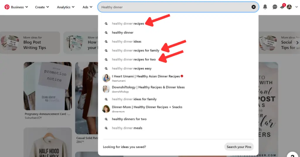
If you can’t find anything good, try being less specific and seeing where it goes from there. Sometimes you do have a good blog post idea, but the keyword is so specific it won’t look like it!
It takes a bit of good sleuthing work to figure out, but once you do, you’ll have a great blog post idea!
But, if you can’t find anything, don’t be afraid to switch up the original plan or scrap what you had! There are plenty more ideas out there to write about.
The next important thing is to have a title that makes people want to click on it. You may have a great blog post, but if the title doesn’t make people care, it won’t matter!
The good thing about WordPress is they’ve got a built-in Headline Analyzer to help you rate your titles and come up with better ones. I used to use this in the browser version, so I’m glad to see it built into the backend of WordPress!
Do your best to get as high of a score as you can and don’t be afraid to test out multiple titles. You can get some ideas from Pinterest if you’re really stuck.
I always test out a few until I land on one I like. What seems to work the best is;
That is quite the balance that you need to hit in order to get a “perfect” title, and no one is ever going to get it 100% right all the time. So just do your best and move on!
Once you’ve got them to click, now you need to get them to stay long enough to read!
As we talked about in this post, you need to format your blog posts well in order to get them to stay, but the intro also needs to be well-written!
Sometimes it can be hard to start a post, especially when you’re not quite sure what you’re going to say throughout it. So, it may be best to work on the intro last.
That way you can give a summary of what they will learn and you’ll know exactly what you talked about so you can hook them in quickly.
I’ve also seen people give a quick anecdote or story in the beginning. Something like “This is what I struggled with, and here’s how I got out of it,” which you’ll explain as the post goes on.
Or you can help the audience feel understood by sympathizing with the issue they are having, and how your post will help them get out of it!
It’ll take some time to get right about understanding how to write a good intro for blog posts, but over time you’ll get better at it!
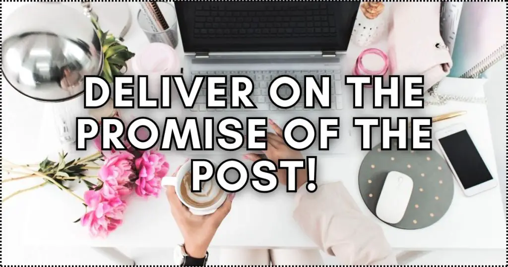
Once you’ve got them hooked, it’s time to actually deliver on the promise that you’ve laid out in the title and intro.
If you don’t meet the reader’s expectations, they’ll leave and they may not come back. People want to get the answers they were looking for and they don’t want to be lied to.
So, whatever you told them they were going to get, give it to them!
Don’t be afraid to go above and beyond what they expect either. The extra little oomph of information they may not have been expecting but ended up finding helpful may encourage them to come back!
You really want people sticking around as long as possible. Becoming followers, sharing your post, signing up to your email list- whatever it is. You want people to stick around! And this is the best way to do it.
Don’t forget where we started either! Once the post is written, go back and proofread and add in the extra formatting you need.
Make paragraphs longer or shorter, add images, call-out boxes, or quotes like I did- anything you feel you need to format your blog posts.
This is going to keep people from getting bored and losing interest when reading a wall of text because you were able to add other things in and format your blog posts well.
But once you’re done, make sure they don’t leave and never return!
Encourage people to stick around by giving them a call to action. Either to another blog post, engage by leaving a comment, or whatever else you’d like them to do once they’re done reading your blog post.
If you can do this well enough time and time again, you’ll have a successful blog!
And if you’d like to stick around this blog and read more from me, you might like these posts right here!
YOU MAY ALSO LIKE: